Tables
Data tables are used to show a large amount of discrete data with multiple categories. Data can be filtered and ordered using a data table. For any data visualization, the table with raw data should accompany it. Tables are the simplest and most accessible way to display data, and provide specific information about each data set. Tables allow the user to reference individual values, while visualizations are better able to represent trends derived from these values.
Tables should always include brief but informative titles.
Tables can be used to display both quantitative and qualitative data.
Simple Table
Simple tables are the easiest way to display data and provide a clean look on your page. Simple tables are great for a small number of categories or values, but should include additional elements if increased readability or interactivity is required.
Simple tables are styled as follows:
Title: Each table has a title that uses heading 3 (Rubik Medium at 24px with a 10pt tracking modifier). The table is placed 13px below the title. The table is the width of its container and the height depends on the data and how pagination is handled on the table.
Header Row: Table headers are displayed in heading 6 (Nunito Sans Bold at 16px) and are left aligned. The header has a padding of 21px (top and bottom) and 27px (left). The heading row has a bottom border of 2px using the colour (#96a8b2)
Table Cell: Table cell information is displayed using regular text style (Nunito Sans Regular at 16px) and are left aligned. The text has a padding of 21px by 27px. The heading row has a bottom border of 2px using the colour #96a8b2. Each row has a bottom border of 1px using the colour #96a8b2.
Simple Table Example
| # | First name | Last name | Handle |
|---|---|---|---|
| 1 | Mark | Otto | @mdo |
| 2 | Jacob | Thornton | @fat |
| 3 | Larry | the Bird |
<table class="table">
    <thead>
        <tr>
            <th scope="col">#</th>
            <th scope="col">First name</th>
            <th scope="col">Last name</th>
            <th scope="col">Handle</th>
        </tr>
    </thead>
    <tbody>
        <tr>
            <th scope="row">1</th>
            <td>Mark</td>
            <td>Otto</td>
            <td>@mdo</td>
        </tr>
        <tr>
            <th scope="row">2</th>
            <td>Jacob</td>
            <td>Thornton</td>
            <td>@fat</td>
        </tr>
        <tr>
            <th scope="row">3</th>
            <td>Larry</td>
            <td>the Bird</td>
            <td>@twitter</td>
        </tr>
    </tbody>
</table>
Striped Table
Striped tables are often used to improve readability. If your data is more complex, or values are similar, a striped table may increase readability and comprehension of the data.
Striped tables are styled as follows:
Title: Each table has a title that uses heading 3 (Rubik Medium at 24px with a 10pt tracking modifier). The table is placed 13px below the title. The table is the width of its container and the height depends on the data and how pagination is handled on the table.
Header Row: Table headers are displayed in heading 6 (Nunito Sans Bold at 16px) and are left aligned. The header has a padding of 21px (top and bottom) and 27px (left). The heading row has a top and left border of 1px and a bottom border of 2px using the colour #96a8b2 The last header in the table also includes a right border of 1px.
Table Cell: Table cell information is displayed using regular text style (Nunito Sans Regular at 16px) and are left aligned. The text has a padding of 21px by 27px. The heading row has a bottom border of 2px using the colour #96a8b2. Each cell has a left, and bottom border of 1px with the colour #96a8b2. The last cell in each row also has a right border of 1px.
Every second row has a fill of #F2F5F6.
Striped Table Example
| # | First name | Last name | Handle |
|---|---|---|---|
| 1 | Mark | Otto | @mdo |
| 2 | Jacob | Thornton | @fat |
| 3 | Larry | the Bird |
<table class="table table-striped">
    <thead>
        <tr>
            <th scope="col">#</th>
            <th scope="col">First name</th>
            <th scope="col">Last name</th>
            <th scope="col">Handle</th>
        </tr>
    </thead>
    <tbody>
        <tr>
            <th scope="row">1</th>
            <td>Mark</td>
            <td>Otto</td>
            <td>@mdo</td>
        </tr>
        <tr>
            <th scope="row">2</th>
            <td>Jacob</td>
            <td>Thornton</td>
            <td>@fat</td>
        </tr>
        <tr>
            <th scope="row">3</th>
            <td>Larry</td>
            <td>the Bird</td>
            <td>@twitter</td>
        </tr>
    </tbody>
</table>
Interactive Data Table
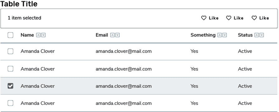
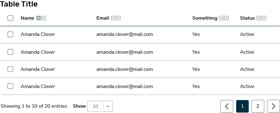
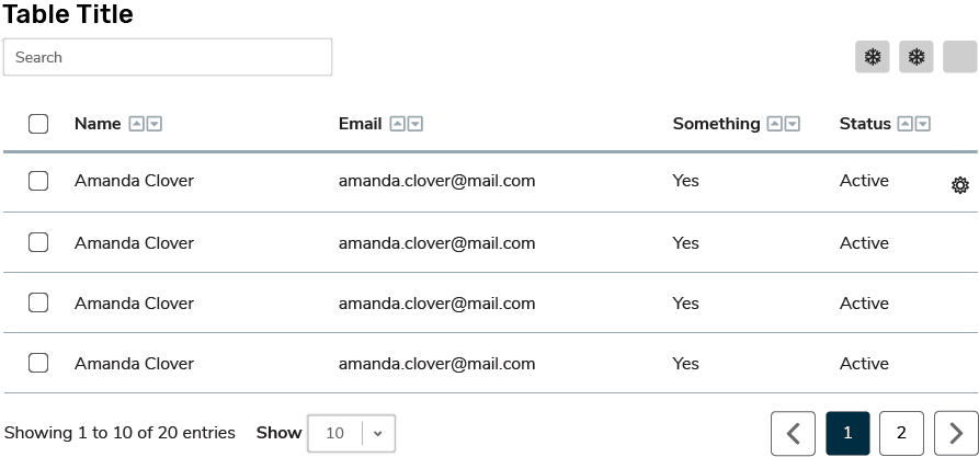
Data tables include interactive elements so that users can manipulate and filter data. Data tables use the simple table template, with added interactive elements. The most common interactions to include in a data table are sorting icons or a checkbox column. Only include a checkbox column if there are actions to perform on a specific row of data.
If checkboxes are included in the table, active rows should be highlighted with a fill of #F2F5F6.
Some other examples of interactive elements to add to a data table are: pagination, filters, search bars, icon buttons, sorting icons, etc.