Choosing Visualizations
Tables
Tables are a raw format for displaying data sets. If a more complex visualization is used, a table should also be present somewhere on the page so users can choose how they view and analyze data.
Tables may be all you need to visualize your data. Simply using a table is great if:
- It is a small and easily-analyzed data set
- Users need to look up individual values
- Precise values are required
- Quantitative information in the data set uses more than one unit of measure
- The data doesn't need to communicate trends or relationships
In this case, put extra effort to make your table as readable as possible, and consider adding interactivity (i.e. filters, sort functions) to your table so users can manipulate and view key pieces of the data set.
Table Example
| # | First name | Last name | Handle |
|---|---|---|---|
| 1 | Mark | Otto | @mdo |
| 2 | Jacob | Thornton | @fat |
| 3 | Larry | the Bird |
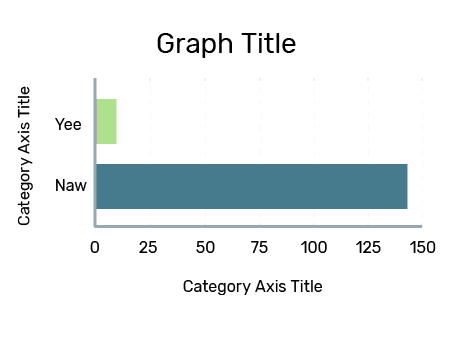
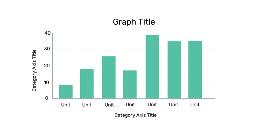
Bar and Column Graphs
Bar graphs (horizontal bars) and column graphs (vertical bars) are ideal for comparing the results of one variable. Column and bar graphs are ideal for comparing a small number of categories (5-15). Bar graphs are best used when there are more than 10. If you have more than 15 categories, consider other type of visualizations or multiple, smaller graphs.
Column graphs can also be used to show comparisons across multiple variables, but it is recommended to keep this number to a minimum.
Overall, column graphs should be used over bar graphs. Bar graphs are ideal if your data labels are long and require more visual space, or if you have more than 10 items (bars) to show.
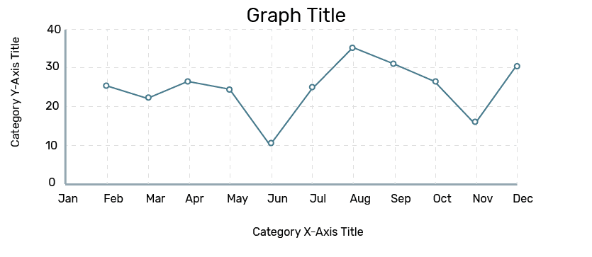
Line Graphs
Line graphs are ideal if you have a continuous data set and wish to show trends or changes over time. This type of visualization is also useful if you are comparing different categories of data (i.e. using multiple lines). Line graphs are most effective when you have at least 20 data points to show.
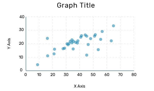
Scatterplots
Scatterplots are the best form of distribution analysis. They are best used with large data sets and to show correlations or relationships between non-time variables. Scatterplots are only effective if there are enough to data points to strongly indicate a correlation (or lack thereof), generally, the more data points a scatterplot has, the better.
Scatterplots may also help to identify outliers or anomaly cases in your data set.