Line Graphs
Timeline
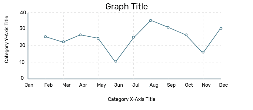
Run charts are a type of line graph that are used to show changes in data over time. The time value should always be represented on the x-axis. Do not have more than three data sets shown in the graph, as your graph will become hard to read and process.
A useful feature to add to your run chart is the ability for users to zoom in and out to particular points of time represented on your graph.
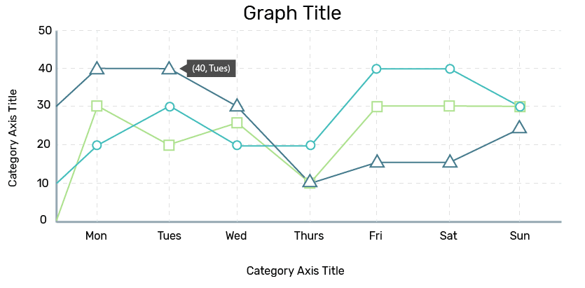
Multiple Variable Line Graph
When using multiple data series in a run chart, include a legend. See [Legends and Tooltips] for more information. Using different shapes for data points will also help distinguish multiple variables and increase accessibility.
For multiple variables, use a different colour for each line, and make sure there is enough contrast between them so they are easily distinguishable.
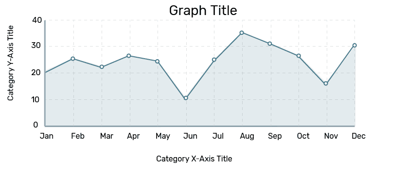
Area Graphs
Area graphs are line graphs that can be used to represent quantitative data. You can use a stacked area graph to represent a part-to-whole relationship between data series. Use a lower opacity if the series overlaps so all series can be seen. Area charts can also be used to emphasize visual volume for a single data series of discrete objects.
Area graphs should be filled in with the same colour as the line, but at 15% opacity.