Column and Bar Graphs
Bar graphs should be used to represent direct comparisons. Numerical values should always be shown beside visual elements.
Bars should be twice as wide as the space between them.
In bar graphs each variable should consistently be represented using one colour. Negative bars should use the same colour but at 60% opacity. Multiple colours can be used if there is more than one variable, but each variable has its own colour.
Graph bars should never have a rounded top. A straight line precisely shows where the bar ends.
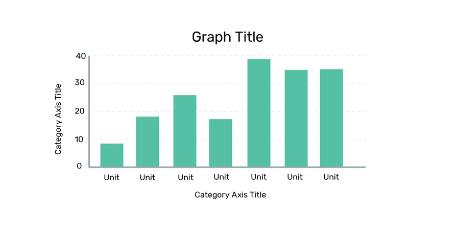
Column Graphs
Column graphs use vertical bars to represent data.
If you are using time as a variable in your visualization, always use a column graph.
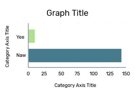
Bar Graphs
Bar graphs follow the same standards as column graphs, simply using horizontal instead of vertical bars. Bar graphs are only used to replace column graphs in a few cases:
- If data labels are long and require more visual space.
- If you are showing more than 10 items.