Legends and Tooltips
In general, legends and tooltips should only be used on data sets when absolutely necessary. If enough context can provided directly on the chart or graph without obscuring data or adding a significant amount of visual clutter, a legend or tooltip is not needed.
Never use a legend if you only have one data category.
Legends
Legends should only be used if the graph contains multiple data series.
Legends should typically be aligned to the side of the graph, unless there is secondary axis in which case the legend should be placed at the bottom of the graph.
Do not rely only on colour. Different shapes can be used for individual data points to make the sets more distinguishable.
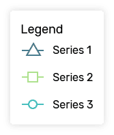
Side Aligned Legend
Side-aligned legends are styled as follows:
Card component, rectangle (white, #FFFFFF) with a border radius of 4px, drop shadow with 15% opacity and 5px blur. Padding of 20px by 16px. The text "Legend" is aligned to the top of the box and uses heading 3 style (Nunito Sans Regular at 18px). Each list item has a padding of 14px by 0px and uses the normal paragraph style (Nunito Sans Regular at 16px) the text is aligned to the right of the symbol. The height and the width of the legend depends on the number of list items.
Bottom Aligned Legend
Bottom-aligned legends are styled as follows:
Card component, rectangle (white #FFFFFF) with a border radius of 4px and a drop shadow with 15% opacity and 5px blur. Padding of 20px by 16px. The text "Legend" is aligned to the top of the box and uses heading 3 style (Nunito Sans Regular at 18px). Each list item has a padding of 14px by 11px and uses the normal paragraph style (Nunito Sans Regular at 16px) the text is aligned to the right of the symbol. The list items are displayed inline, so the length of the container depends on the number of list items. The height is 96px if all the list items fit along one line.