Blogs
7 Things I Learned from Leading a Design Project
Written by Sierra Duffey. June 19, 2018
In November, two developers and I started working on a design system for Government of Canada digital collaboration applications to guide the design of the next iteration of the GCTools. Over many days of planning and late afternoon epiphanies, we came up with a solid strategy and work plan to build something awesome.
Fast forward to today and we have four developers, three writers, three user experience researchers as well as design expertise across the whole project team. We’ve collaborated with six partners across four different organizations. Most importantly, over the past months, we’ve built and compiled a large repository of content that matches the calibre of private tech companies, and connects the Government of Canada’s various digital resources, policies and learning material.
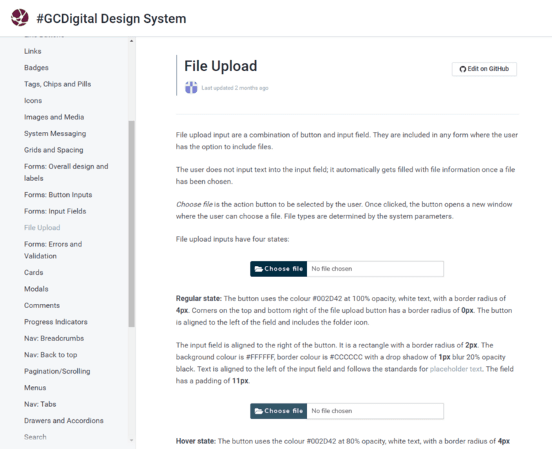
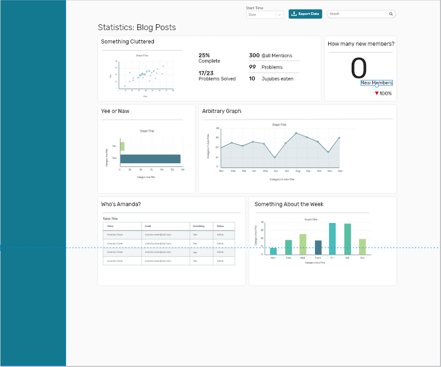
Example of our design system documentation
After six months of managing a project, I’ve definitely learned many things about myself, my teammates and the challenges surrounding every innovative or unconventional government project. Here are some of our key lessons learned:
Get to know people on your team ; they are everything to the success and enjoyment of your project. Knowing the strengths and weaknesses of the people on your team makes delegating tasks so much easier, and everyone should get a say and get a chance to work on something they’re interested in. And having a group of people that works well together makes everything smoother and more fun!
Building anything new is a messy process. Try to organize the chaos best you can, but accept that the amount of uncertainty and tough questions will feel overwhelming at times.

Be strategic about working with others. Partners and collaborators are valuable, but can also broaden the project far beyond its original scope. Stick to your original goals and have a clear plan from the start on who to engage with, and when to engage them.
Planning is good; building is better. Since this project started in parallel with the rebuild of our applications, there were a lot of questions that were still unanswered. At some point we had to just get started and see what kind of process evolved. We had to adapt our original process as we went, but no amount of planning would have avoided that.
Democracy is good, but eventually someone has to make a decision. Critique and feedback is necessary, but not every decision will be a full consensus. That’s okay. Have faith in your judgment, and change things later as you gain new information.
Content is always king. Your work should speak for itself. Be proud of it, pour all your expertise into it, and take ownership of your work! (Even if we’re so often afraid in government to do that).
Bonus: Food is always the best way to get to know people, to apologize, or to celebrate. Start your meetings off right with Timbits!
Curious to know where we’re at with the Design system? Now in phase II, our design system currently contains enough content to start building application wireframes, learn more about design, and apply common styles to all our digital products. Completely open, the design system is available via our Github repository and our Gitbook documentation.
As the GCTools and other digital applications evolve, our design system will undertake constant modifications and additions. Do you have suggestions or comments about our content? Want to make use of our system? Submit an issue through Github or contact me directly!
Example of a prototype built using our design system elements
Starting From Scratch: Building the new GCTools Design System
Written by Sierra Duffey. January 9, 2018
I‘m in my early 20s, still in school, and completely new to design. But somewhere in the last four months of working with the Digital Collaboration Division (GCTools), I found myself leading a major design project, which includes working with multiple partners in the GC and promoting agile development methods.
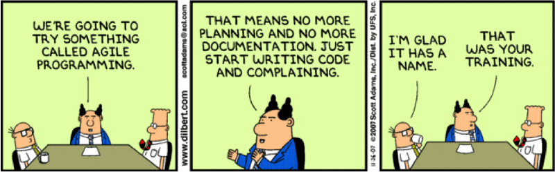
Me trying to explain agile development
As I come into work, I wonder (with awe) how I got here. That’s the beauty of working with a flexible and competent team like the GCTools! After only four months here, I’ve been welcomed into the team with open arms and encouraged to learn on the go. Along the way I’ve definitely had to come to terms with the occasional imposter syndrome, but that means you’re on the right track to building something new.
All of this makes the DCD team a perfect environment to embrace a new challenge like the design system project.
With a refresh of the GCTools on the horizon, the team decided it was time to put together a design system. Developing one is complex; a design system is a huge repository of all elements of your products as well as documentation on how to use them. They are to be as comprehensive as possible, and include everything from visual elements to writing style, guiding principles, and code for specific components. The system provides designers and developers with a clear guide on how to start a new application, without having to make specific design choices over and over. This is useful for our own team and our rebuild, but we’re also excited to work with multiple partners across the GC to make a system that others can use to guide their work as well.

We’re still early into the project, and we’re starting to learn that everyone is new to this. Design systems are used by many of the tech giants such as Google, IBM and Shopify, but is still a new piece for use in the public sector. The U.S. government built their design system last year, and the UK government is currently working on theirs. Although we’re planning to use our design system on a smaller scale — it’s still a huge undertaking, especially considering that we’re learning what we’re doing as we go!
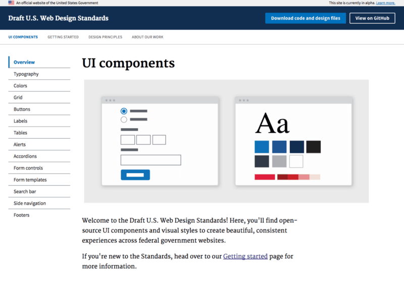
One section of the U.S. Web Design Standards
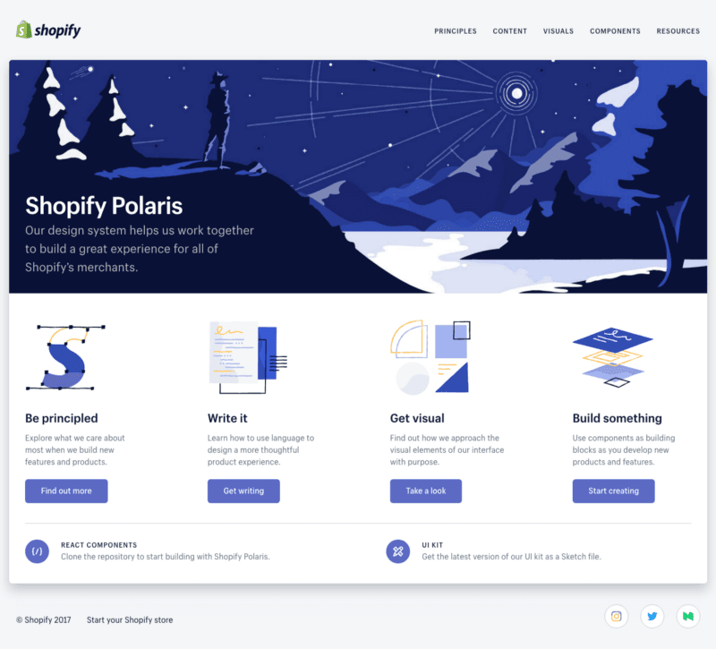
Shopify’s Polaris Design System
We’re starting to ask all sort of questions we didn’t think of before. Writers on our team have to analyze how we communicate with users, and in doing so, we’re finding ways to improve. Front-end developers and designers are researching best practices and re-evaluating our current system and identifying where it could be better. Even though we’re just getting started, the design system is already helping us better understand the new product(s) we want to build, and the experience (visual, written, functional, etc) that we want for users.
I’m excited for this project because taking the time to design and build cool stuff gives you a whole new perspective on your existing and potential products. Bringing in partners from the Canadian Digital Service; Immigration,Refugees and Citizenship Canada; and Talent Cloud has been even more of a blessing, since we get to learn from each other and provide feedback on a regular basis.
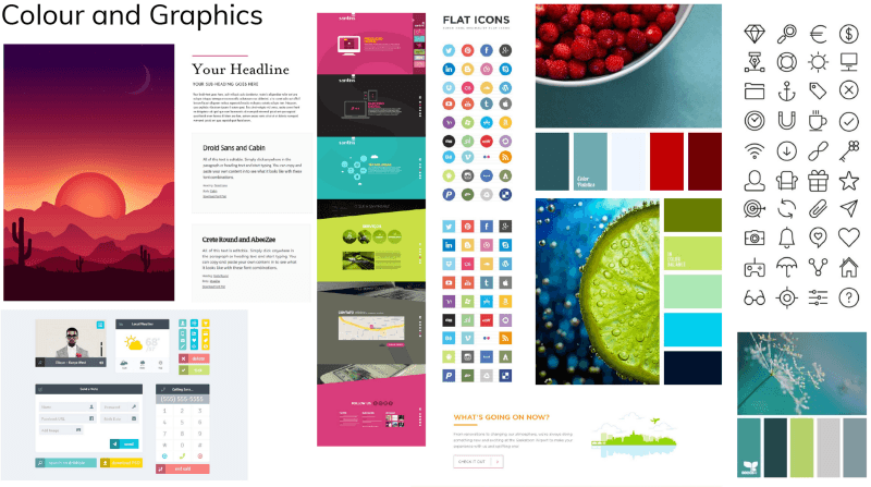
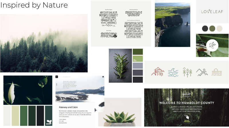
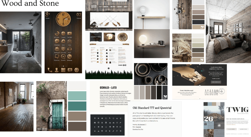
If you want to learn more about the design system we’re building, and how we’re building it, stay tuned! We’re starting our first design sprint on January 10th and we plan on documenting our process along the way, as well as posting all of our files on Github. For now, we’ve created a few inspiration boards to help guide our design. Take a look and tell us your favourite!
Thanks for reading! To learn more or provide feedback, comment below or reach out to me on Twitter, GCcollab and Linkedin.